An ad can be attractive, on brand and completely unhelpful. The photography gets noticed. The headline sounds expensive. The buyer still cannot tell why this product belongs in their life.
That gap is easy to miss when you review a creative at full size in a design file. In the feed, the image, opening line and next step have to do their work with much less cooperation from the reader. Good creative reduces the number of things the buyer has to work out.
Give the ad one job before you give it a headline.
“Sell the backpack” is the business objective. It is too broad to direct the creative. “Show a commuter that they can reach the charger without unpacking the bag” gives the team a scene, a benefit and a reason to believe.
Start by completing this sentence: After seeing this ad, the right person should understand ___ and want to ___. If the blanks contain five benefits and three actions, you are writing a product page in miniature.
A prospect who has never considered the problem needs a recognisable situation. A buyer comparing options may need dimensions, materials or a demonstration. Someone returning to the product page may need a clear answer about delivery. Those are different jobs, even when the product is identical.
Four parts. One continuous argument.
The opening earns a little attention. The visual explains the idea. The detail makes it credible. The next step continues the same thought. Tap the notes to see how that sequence works.
Less rummaging.
More out the door.
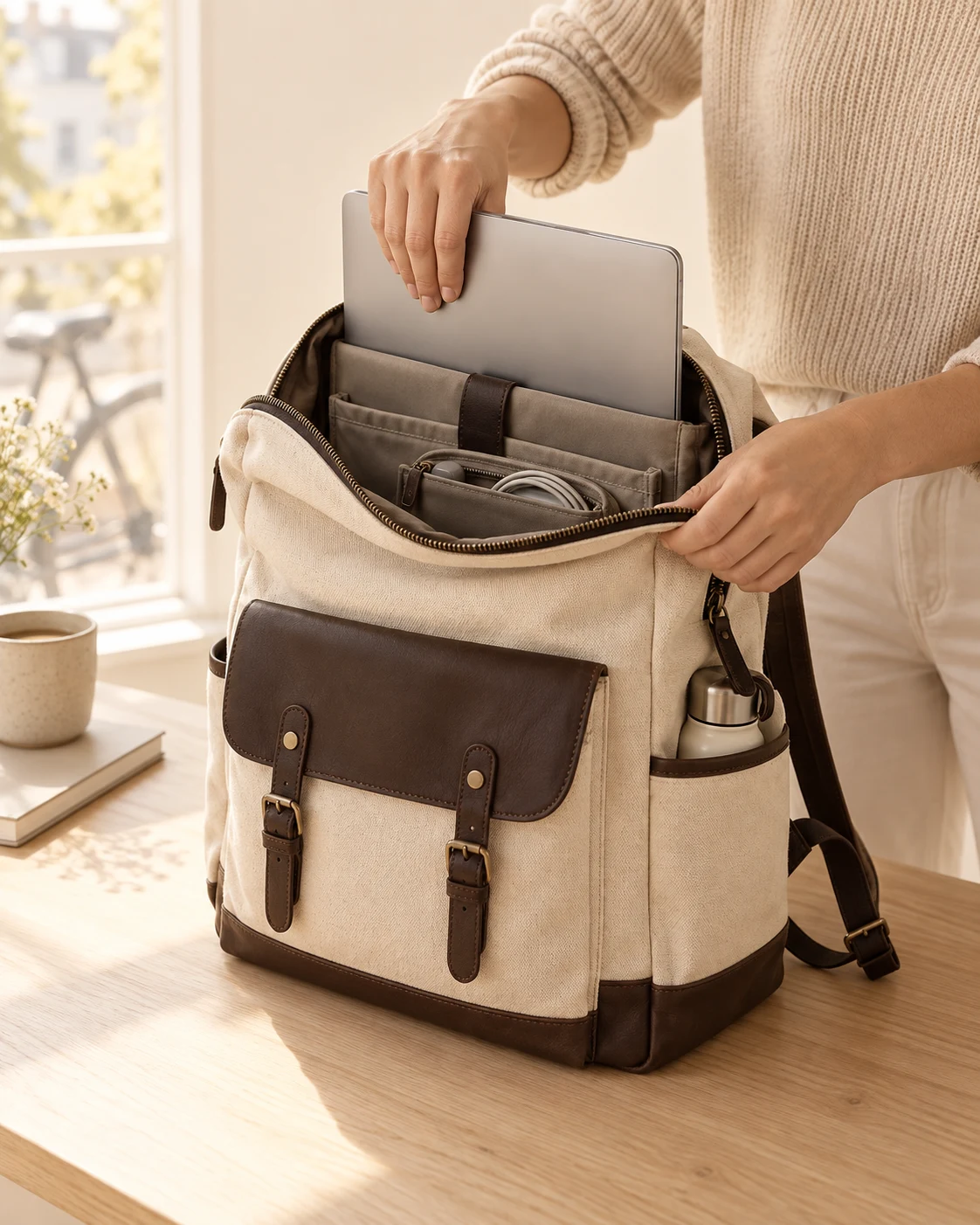
A place for your laptop.
A pocket for the little things.
Notice what the concept leaves out: a discount, a testimonial, a material manifesto and a claim to be the best bag in the world. Those might matter elsewhere. Here, each addition would compete with the one thing the ad is trying to make clear.
Shrink the ad to the size it will appear in the feed. Can you still read the opening, identify the product and understand the next step? If not, remove a competing element before adding another line of copy.
Show the reason to believe, not just the reason to want.
“Stay organised” is a benefit. A visible, accessible cable compartment is an explanation of how the benefit happens. Strong creative often becomes more persuasive when it moves one level down from the promise to the mechanism.
Ask what kind of doubt the buyer has. If it is fit, show measurements and the actual item inside. If it is difficulty, demonstrate the real steps. If it is durability, use an appropriate, documented test. If it is taste, a close-up can help, but it cannot establish that everybody will like it.
Do not ask an image to prove something it cannot. An AI-generated product scene can explore a composition. It cannot verify the product’s compartments, colour, capacity or performance. When details are part of the claim, replace the concept image with accurate product material and check the words against the specification.
The more specific the promise,
the more specific the proof needs to be.
The old copywriting discipline of explaining why a claim is true is still useful. Hopkins devoted chapters to specificity and testing. The application today is to make the evidence inspectable, rather than borrowing the tone of certainty from a famous ad. Scientific Advertising ↗
Find the broken handoff before you rewrite everything.
A weak result does not identify the weak component. Read the path from impression to purchase and check the measurement before assigning blame.
| Pattern worth investigating | What to inspect next |
|---|---|
| Little attention or outbound response | Opening clarity, visual relevance, placement crop and whether the buying situation matters. |
| Clicks, but few landing-page views | Page loading, accidental clicks, redirects and whether click and view definitions align. |
| Visits, but little purchase intent | Message continuity, product fit, price, proof and the audience attracted by the hook. |
| Checkout intent, but few completed orders | Shipping surprises, payment errors, availability and checkout friction. |
These are diagnostic leads, not verdicts. A high click-through rate can come from curiosity that has little purchase intent. An ad with lower click-through can still acquire better customers. Compare the business outcome with enough data and a consistent attribution window; do not crown the most clickable line by itself.
For lead generation, follow the path beyond the form. Cheap leads that sales cannot contact are a different result from qualified appointments. Agree on the downstream quality measure before the creative test starts.
Make each line answer the question the last one raised.
Consider a desk lamp. “Elevate your space” offers almost no buying information. “Still working under the big light?” opens a recognisable scene. The next line should explain what changes when the lamp arrives.

HOOKStill working under the big light?
MECHANISMA focused pool of light, right where the notebook goes.
NEXT STEPSee the lamp on a real desk.
The sequence moves from situation to mechanism to inspection. It does not need to jump from a familiar frustration to a miraculous life change. Read your copy aloud and mark any point where the reader must supply a missing argument.
Then check the click destination. A CTA about seeing the lamp on a desk should lead to a page that quickly shows scale and the light in use. Nielsen Norman Group describes how people use contextual cues to judge whether a link will take them towards what they need. That is why a clear next step and a matching destination belong in the same review. Information scent ↗
Five questions for the final review.
- Who recognises this moment? Name a buying situation, not “everyone who likes quality”.
- What is the single promise? A reader should be able to repeat it without seeing the brief.
- What makes it believable? Check the visual, the claim and the source of the evidence together.
- Where does the next step lead? Open the page on a phone and follow the path yourself.
- What will this test teach us? Write the hypothesis before the results arrive.
Faster production gives you more chances to make these decisions. Its value comes from shortening the distance between an informed idea and a useful result. If every new image repeats the same vague argument, the extra volume mostly gives you more files.
Brand context, considered briefs and a small batch you can review. That is the working rhythm behind Varaliq. The useful part is what you learn and carry into the next round.
Explore the creative workspace